Why Taupe? The Color That Breaks All the Neutral Rules
Let’s cut to the chase. Taupe isn’t just another boring neutral. It’s the chameleon of kitchen design that solves multiple decorating dilemmas in one smart color choice.
The Magic of Taupe: More Than Just a Color
What Makes Taupe Special:
- Blends gray and brown with magical undertones
- Warmer than stark white
- Softer than harsh grays
- Hides kitchen chaos like a pro
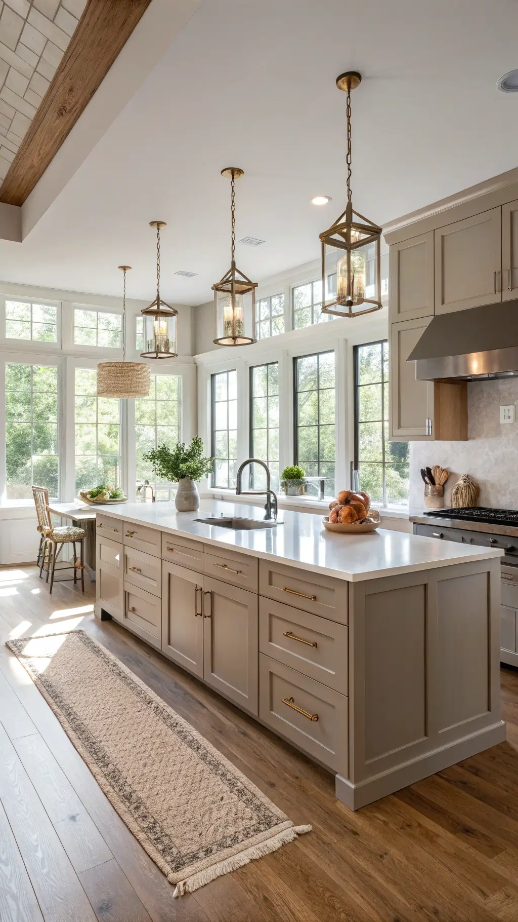
💡 Steal This Look
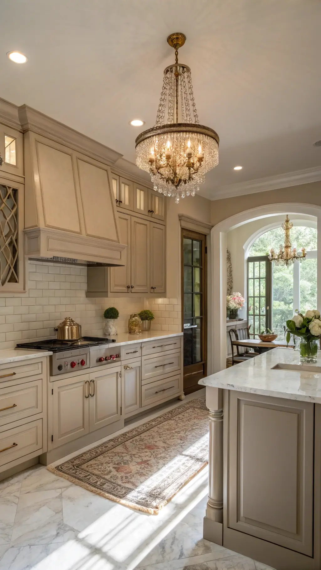
- Paint Color: Sherwin-Williams Balanced Beige SW 7037
- Furniture: warm wood bar stools with natural grain finish
- Lighting: brushed brass pendant lights with warm LED bulbs
- Materials: natural wood countertops, subway tile backsplash, brass cabinet hardware
There’s something deeply satisfying about a taupe kitchen that feels both sophisticated and lived-in. It’s the perfect backdrop for morning coffee and evening entertaining without demanding constant perfection.
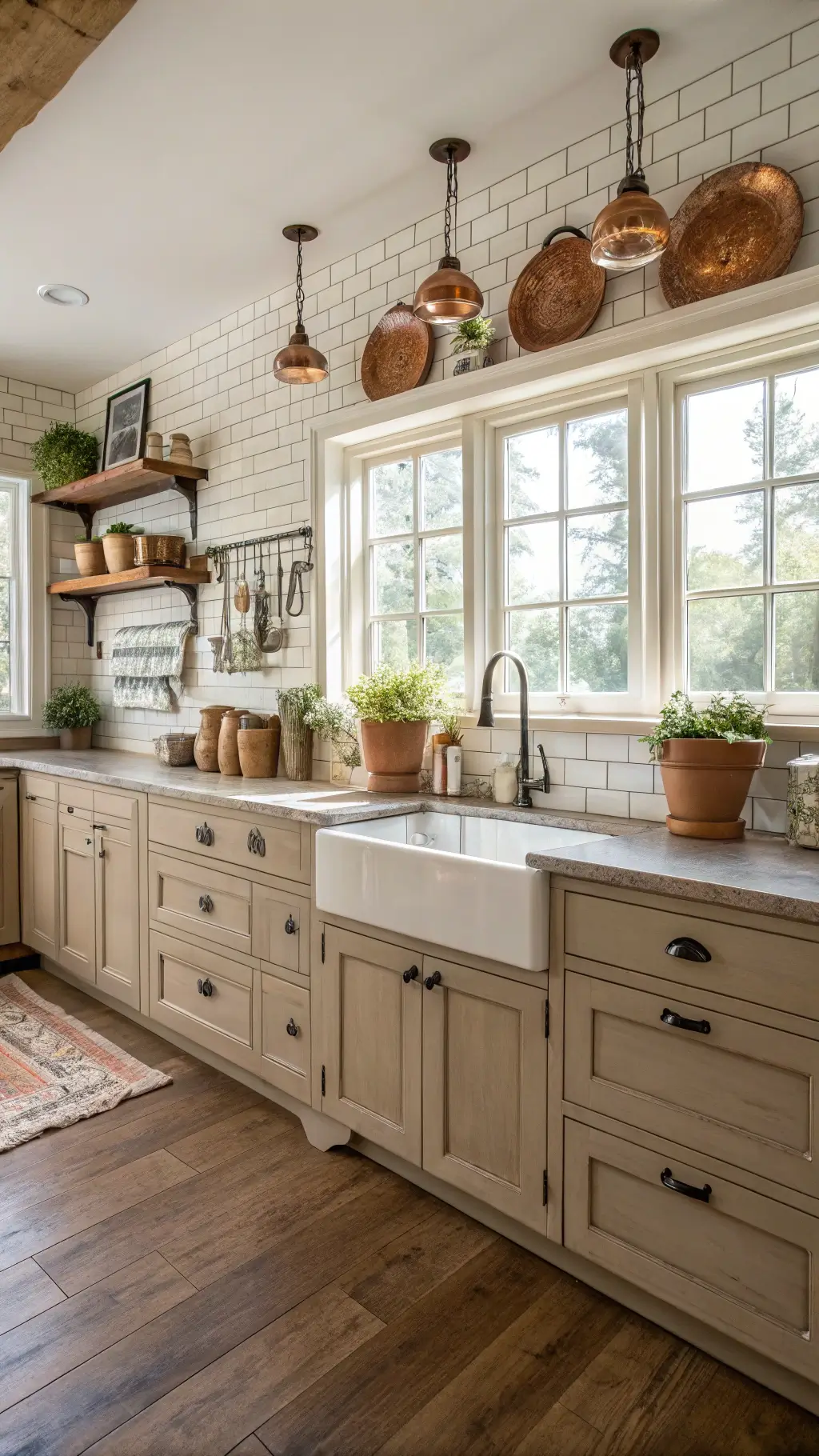
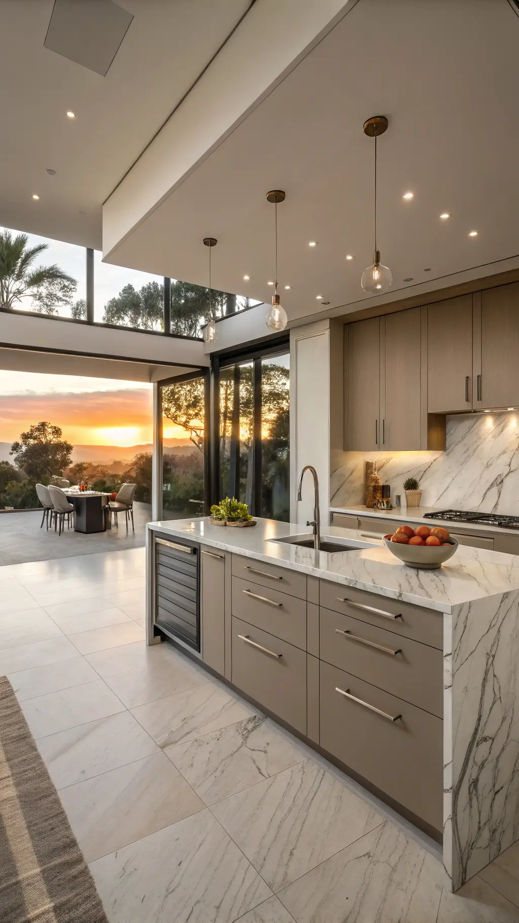
Style Versatility: From Farmhouse to Modern Minimalist
Imagine a color that works in literally ANY kitchen style. That’s taupe for you. Whether you’re rocking a vintage farmhouse vibe or a sleek modern kitchen, these cabinets are your design soulmate.
Styling Taupe: Endless Possibilities
- Traditional Kitchens: Pairs beautifully with classic marble countertops
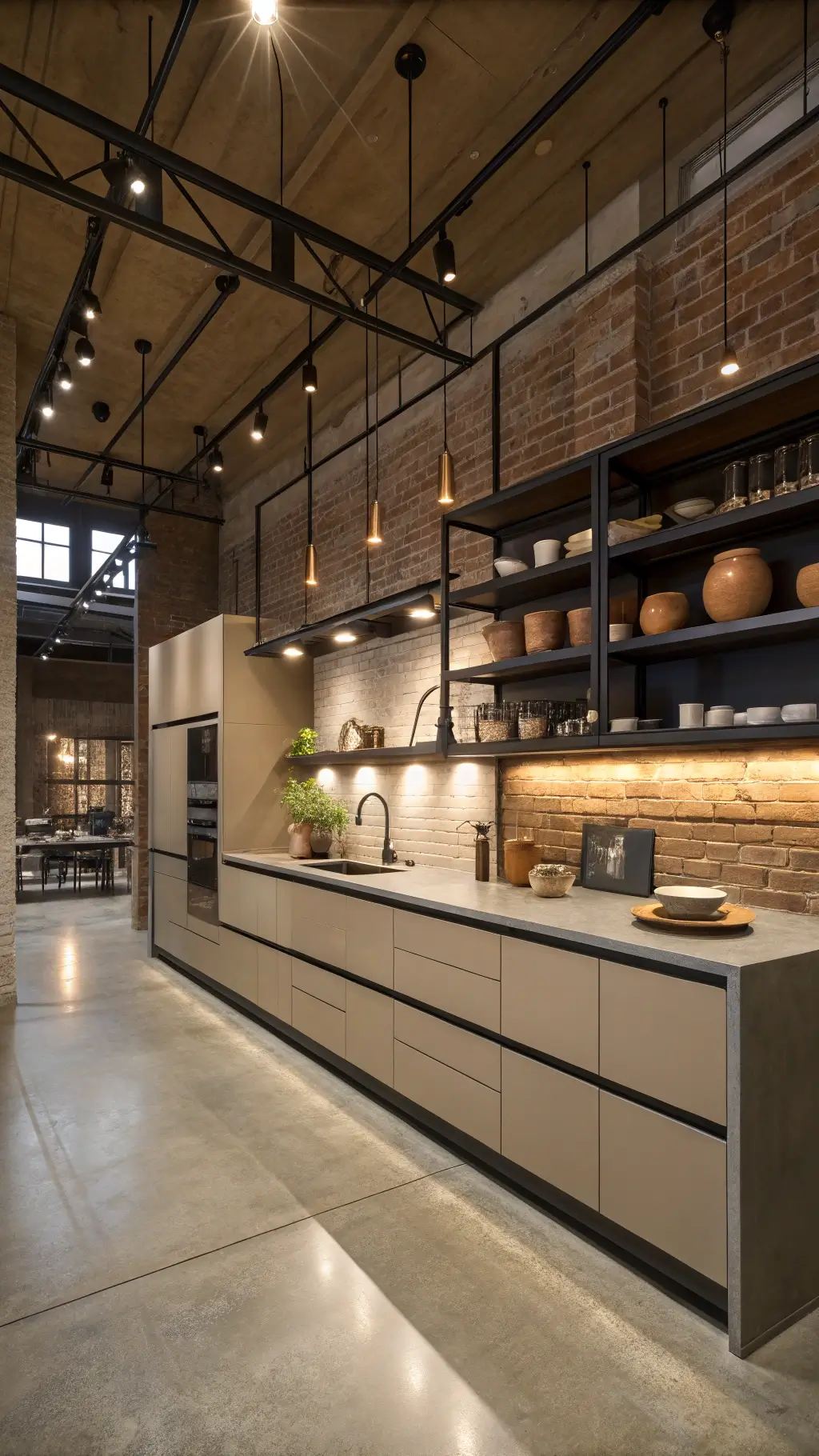
- Modern Spaces: Complements stainless steel and concrete elements
- Rustic Designs: Looks incredible with natural wood accents
🖼 Steal This Look
- Paint Color: Benjamin Moore Balanced Beige HC-90
- Furniture: white marble waterfall island with natural wood bar stools
- Lighting: brushed brass pendant lights with clear glass globes
- Materials: warm taupe painted wood, honed marble, brushed stainless steel
There’s something magical about a color that adapts to your changing style whims. Taupe cabinets are like that perfect friend who looks great whether you’re dressed up or casual.
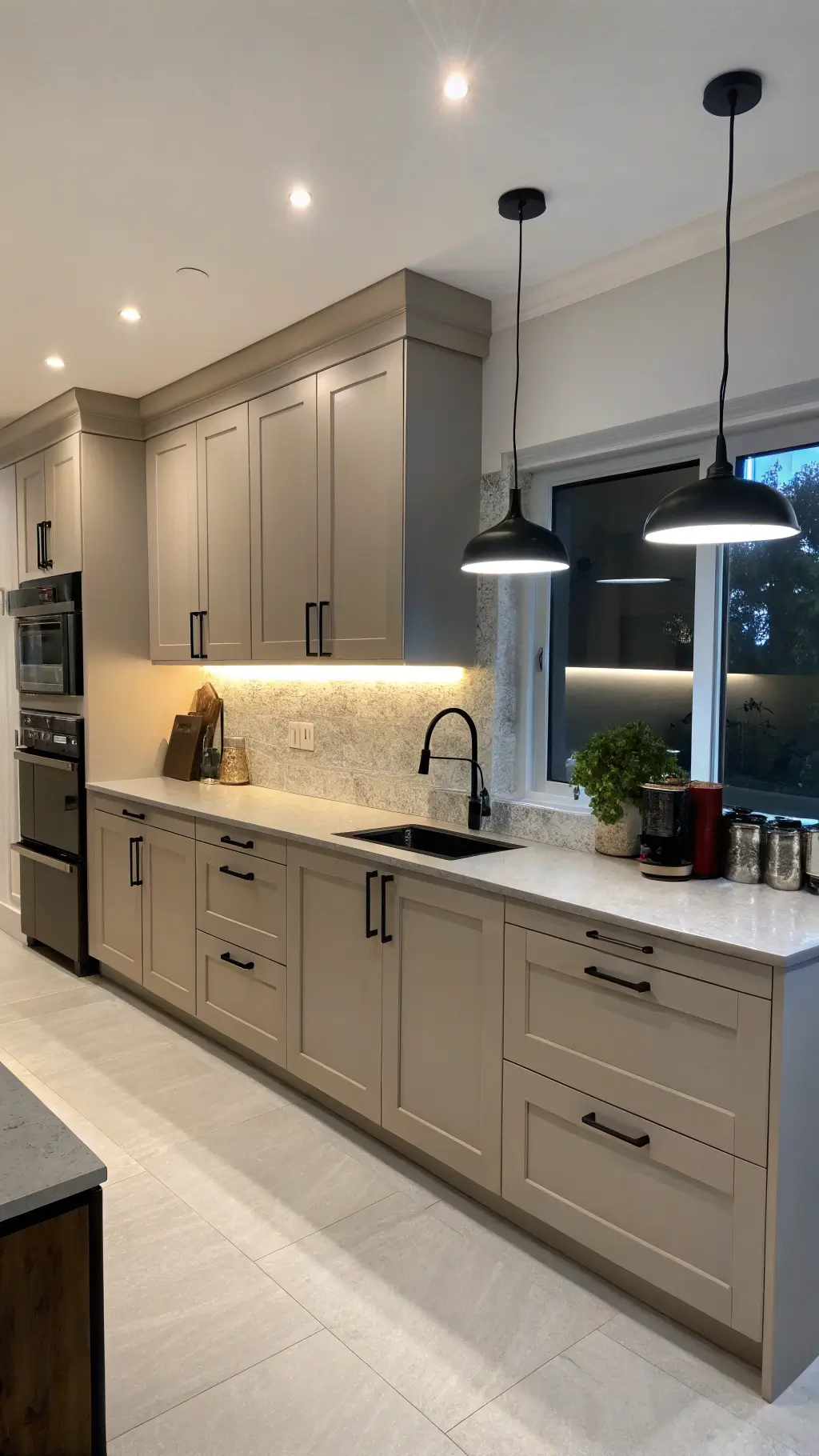
Practical Perks: Why Taupe is the Smart Choice
Forget high-maintenance white cabinets that show every single fingerprint. Taupe is the low-drama, high-performance cabinet color you’ve been dreaming about.
Real-World Benefits:
- Fingerprint resistant ✓
- Hides minor wear and tear ✓
- Works with multiple design palettes ✓
- Timeless appeal that won’t look dated ✓
🌟 Steal This Look
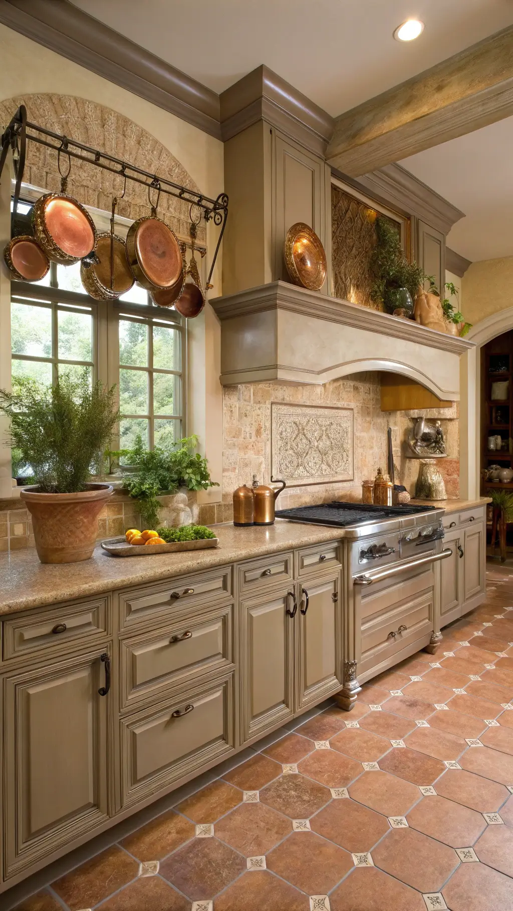
- Paint Color: Farrow & Ball Mouse’s Back No.40
- Furniture: warm wood bar stools with natural grain and brass hardware
- Lighting: warm brass pendant lights with clear glass shades
- Materials: natural stone countertops, warm wood flooring, and brushed brass cabinet hardware
There’s something deeply satisfying about opening beautiful cabinets that don’t betray every coffee spill or sticky finger. Taupe gives you that lived-in elegance without the constant maintenance stress.
Top Taupe Paint Recommendations
Pro tip: Not all taupe is created equal. These are my absolute favorite shades:
- Sherwin-Williams “Perfect Greige”
- Benjamin Moore “Balance”
- Behr “Mocha Foam”
💡 Steal This Look
- Paint Color: Behr Mocha Foam MQ2-17 for warm undertones that complement natural wood cabinets
- Furniture: white or cream kitchen island with butcher block countertop
- Lighting: brushed brass pendant lights over island
- Materials: natural wood grain, matte cabinet hardware, subway tile backsplash
I’ve painted dozens of kitchens, and taupe cabinets create that perfect ‘not-too-warm, not-too-cool’ foundation that works with both brass and nickel hardware. It’s the chameleon color that adapts to your style.
Design Compatibility: A Quick Cheat Sheet
| Style | Taupe Compatibility | Styling Tips |
|---|---|---|
| Modern | Excellent | Pair with sleek hardware |
| Traditional | Perfect | Add classic bronze accents |
| Minimalist | Outstanding | Choose lighter, cooler taupe tones |
| Farmhouse | Incredible | Mix with natural wood and white details |
🏠 Steal This Look
- Paint Color: Valspar Café au Lait 6003-2A
- Furniture: white quartz countertops with natural wood bar stools
- Lighting: brushed brass pendant lights over kitchen island
- Materials: warm taupe cabinet finish with bronze hardware and subway tile backsplash
The beauty of taupe kitchen cabinets lies in their chameleon-like ability to adapt to any design style you love. Whether you’re drawn to sleek modern lines or cozy farmhouse charm, taupe provides the perfect neutral foundation that never feels boring.
Pro Designer Secrets
After years of transforming kitchens, here’s my inside scoop: Taupe isn’t just a color, it’s a design strategy. Those subtle undertones (sometimes a whisper of violet or beige) make it incredibly forgiving and adaptable.
Real Talk: What Designers Know
- Taupe creates warmth without overwhelming the space
- It’s the ultimate “neutral plus” color
- Works with virtually every design aesthetic
🏠 Steal This Look
- Paint Color: PPG Balanced Beige PPG1088-3
- Furniture: warm wood bar stools with natural grain
- Lighting: brushed gold pendant lights over kitchen island
- Materials: natural wood grain, warm brass hardware, subtle veining in quartz countertops
As someone who’s guided countless clients through kitchen renovations, I’ve seen taupe cabinets transform spaces from cold and sterile to warm and inviting. The secret is understanding that taupe isn’t just one color – it’s a family of sophisticated neutrals that work harder than any other cabinet choice.
Final Thoughts: Why Taupe Wins
Taupe kitchen cabinets aren’t just a trend. They’re a design revolution that solves color matching, maintenance, and style challenges in one brilliant stroke.
Pro Recommendation: If you’re hesitating, don’t. Taupe is the most intelligent neutral you’ll ever choose.